Using colour to deliver an effective exhibition or display
We often take colour for granted, until we see something that is so vivid or beautiful that it stops us in our tracks! In the world of display, it’s an incredibly important tool for drawing attention to your product or service.
Colour can be used through lighting effects or more simply through the graphics used within an exhibition stand. Use it to create an atmosphere or to present your brand in a certain way.
To begin, let’s consider a few scenarios.
Use earthy neutral tones if you want your brand to be associated with eco-friendliness or with organics.
Using these colours can create a more natural theme to a stand, and emphasise the eco qualities of the brand being displayed.
Using colour like this works subliminally to create an overall impression and feel.
Clever use of lighting can dominate an event or stand. Lighting up a stand in your signature colour – Like Vodafone and its vibrant red – makes a powerful statement, and cuts through any other ‘noise’ in the room.
At Displays 2 Go, we can light a display case with a particular brand colour to draw the eye to it and emphasise the connection of the product to the brand. We can also use our Plinths with lighting which are very effective and can change colour at the click of a button.
If you’re not restricted to a particular colour for your stand, consider how different colours affect people. Pantone publishes a useful guide to colours and responses that they illicit. Orange tends to represent fun, happiness, tang, juiciness and friendliness where as light green is more trustworthy, refreshing, cool, restful and traditional. Navy is perceived as authoritative, credible, classic and conservative.
Colours also go through trends. You only need to take a look at fashions on the catwalk to see how colour trends change each season. Whether it’s neon, neutral, pastel or monochrome, colour conveys tone and helps visually illustrate a story by evoking mood and feelings. Right now neon seems to be back in trend, so if you’re appealing to a fashionable crowd consider using this to generate appeal.
Think about your target market when designing your display, as colour appeal can also depend on gender. For instance we know that – traditionally – blue tends to appeal more to males but that pastel shades are largely the preserve of females. Monochrome black and white has a timeless appeal and simplicity that creates impact and tends to transcend gender.
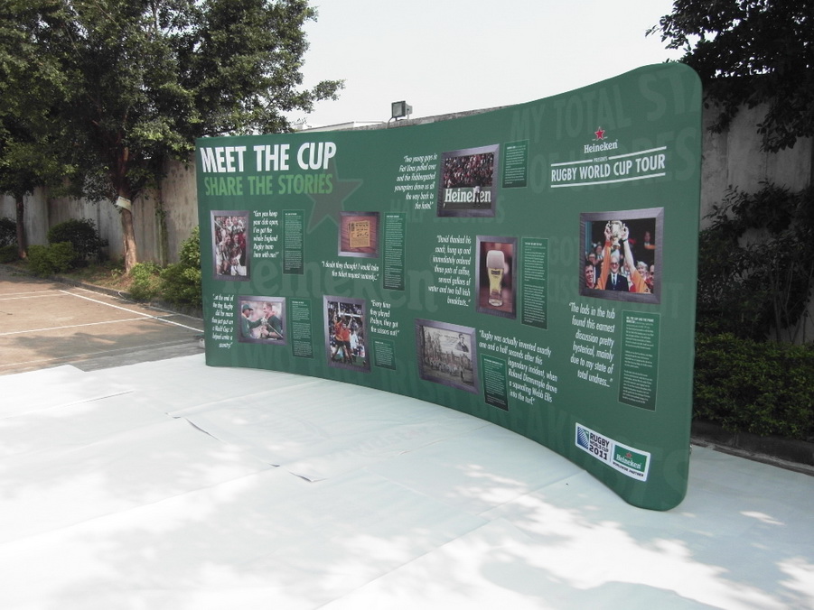
Our SuperWall Display System features dye-sublimated printing onto fabric to ensure the most vivid colours are presented. The fabric is stretched over any shape of frame to provide a seamless and wrinkle free surface. We used the system to create a Heineken branded wall for the Rugby World Cup, capturing perfectly that rich Heineken green.