How to get the best results from backlit displays.
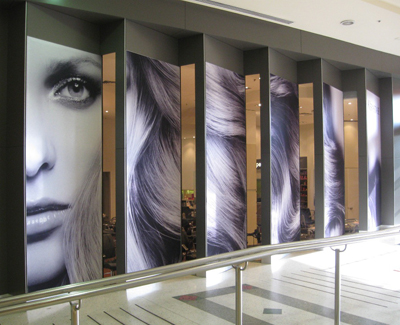
Using backlit displays – that is, a display with lighting behind the graphics – is one of the most powerful ways to add style and attention-grabbing appeal to your displays. It’s now cheaper than ever to produce high-quality, cost-effective backlit displays with powerful graphics to go with them. These developments, coupled with the boom in demand for promotional graphics, has resulted in a sharp increase in illuminated signage demand in the market.
A number of scientific studies have proven that backlit displays draw more attention than a standard display due to the greater intensity of colour saturation and brilliance, which immediately draws the eye.
All illuminated displays are not made equal!
The importance of choosing the right hardware as a starting point is essential. For example, is this a simple display wall or something more complex, like an exhibition stand? Do you need it to be portable or will it stay in the same location? Do you or your team need to assemble it yourselves or will you get us to do it? These type of questions will be a guide as to which display is best for you.
Any budding photographer will tell you the difference in colour between different light sources, commonly called white balance. It’s important to consider your light source, as well as the lighting within the venue where your display is being used, to ensure you deliver your branding accurately.
Key things to consider when preparing your graphics for printing.
Backlit displays and illuminated graphics are different from other forms of printed displays. What looks right on a printed poster may not look right on a backlit display, so it’s important to understand this and prepare your graphics carefully. Often with illuminated displays, you need to take a step back and look at it from a distance, taking in the whole effect. It’s only then that you can really appreciate the effect it has.
There are a number of important points to be aware of to give yourself the best results:
1. Go bold – Illuminated displays make the graphics pop when lit from behind, so when designing a graphic get your designers to think bold, strong colours. The use of darker colours such as blues, reds, blacks, and purples all have a powerful quality when lit. Lighter colours and pastels will lack the visual punch of strong colours, so go as bold as your design will allow.
2. Use contrasting colours – The use of contrast in an image makes a major impact with backlit displays, especially if it is an opposite such as white on black. The reason this is so relevant when backlighting is because of the major variation between how much light will pass through the dark colour versus the light colour. Because there is so much more light shining through the lighter colours means you’ll get an appealing contrast that looks fabulous.
3. Be prepared to see dense colours before the light goes on – When we are preparing your artwork for printing on backlit displays we are thinking about how it will look after the lights go on, not before. In order to give eye-popping vibrancy for back-lighting, we use specific print profiles that will put a lot more ink down onto the graphics so as to greatly increase the colour density. Think of a piece of coloured cellophane, and how different the colour strength will be if looking at it indoors versus holding it against the sun. This extra ink density can make your graphics appear darker in colour when not illuminated, but the effect once lit can be extraordinary.
4. Be realistic about expectations when colour matching – We all know the importance of brand identity, and for many brands getting the colour right is non-negotiable. When it comes to colour matching on an illuminated display, what are you comparing the colour to? A non-illuminated display, such as a brochure or poster? Matching colours across different substrates is possible and can be requested, but be aware of how light passing through both fabric and ink can change the colour. When working with your printer it’s important they understand the difference in materials and the effect it may have.
At Displays 2 Go, we use specific colour profiles for each of the materials we print on so you get accurate colour that looks vibrant when backlit. We’ll work with you to deliver the result that is right for YOU!
Talk to us about your next backlit display project and we’ll help you with the right combination of hardware, lighting and print to give you an eye-popping result.