The importance of colour matching.
Colour is something we often take for granted. Whether it be the colour of the sky, the greeness of the grass, or the way colours react with each other, we all see colour in different ways. However, our eyes can be extremely sensitive to subtle variations in colour. While this might not be the case if they are across the room from each other, if items are in our field of vision at the same time, we will often notice a colour difference.
For this reason, if you are at all concerned about the colour output of your printed assets it’s important you supply your printer with a colour to match when getting them printed. Colour can vary significantly according to the material it is being printed on and the print technology being used. For example, a fabric backdrop wall may look a different colour to a demonstration table graphic wrap which in turn look different to promotional leaflets.
Using the right colour profiles.
Most graphic designers create their work on a computer using part of the Adobe Suite, whether Photoshop, InDesign or Illustrator, and use a range of different colour profiles.
It’s important to let your designer know what you intend to use the design for so they can select the right colour profile. For example, anything that is designed for on-screen use will be designed in RGB, but anything that is printed should be designed in CMYK. It is imperative that you select the right profile for the job otherwise there could be a noticeable difference between how the design looks on screen and the final printed product.
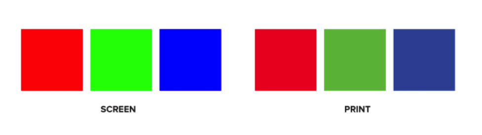
But it’s not just on screen that we see a noticeable difference, there can also be a huge difference in colour between printed products such as paper, card, fabric, boards etc. Therefore supplying your printer with a CMYK colour does not always solve the problem. Why? Well there are a few reasons:
- colour can look different when printed on different materials;
- colours can easily be different if using different printing companies;
- inks can be slightly different on different technologies.
How do we combat colour differences?
You will be pleased to know that there are two trusted ways to avoid all of this uncertainty. Option one is to send a swatch of sample colour for the printer to match to. Option two is to use the universal system that all printers and designers use – the Pantone Matching System (PMS).
Pantone is essentially a library of various colour swatches that can be used as fixed colour references during the design process. Almost every professional design application (e.g. Photoshop) supports the Pantone colour profile, thus making it easily accessible.
How do I choose my Pantone colour?
If you are creating a new brand then it’s recommended that you choose a Pantone colour straight away so that all the promotional material can be matched accordingly.
TIP: Try to choose a colour that has a close CMYK equivalent. That way whether you’re printing in Pantone or CMYK, your brand colour will look very similar.
However, if you already have your brand guidelines and they do not include a Pantone colour then we recommend getting a copy of the book and selecting a colour that closely matches your CMYK. If your book does not have CMYK references then you will have to do some colour matching by printing off your CMYK colour swatch and matching it with some swatches in the book. This may seem cumbersome at the time, but it will ensure that when you sit back and look at your exhibition stand or display you will see a level of consistency that is pleasing to the eye.
Implications of not asking for a colour match
If you do not ask your printer to colour match, they won’t! For this reason, if you end up with a colour you don’t want and you haven’t asked for matching, don’t blame your printer! Many inexperienced event executives will have a stressful colour-related drama early in their careers and will carry the learning from it all through their career – one experience is generally enough!
Displays 2 Go have been in the display and exhibition industry for over 20 years and understand the importance of colour matching, especially when everything is brought together at the end for an event. If you need any further information then please get in contact with one of our sales team who will be happy to help.