The importance of colour in designing an exhibition stand
When it comes to designing an exhibition stand, every aspect counts. The layout, the content, and the graphics must all work in harmony to attract and engage attendees. However, one key element that is sometimes overlooked is colour. Colour can profoundly impact how your exhibition stand is perceived and remembered. In this blog post, we'll take a deep dive into the importance of colour in exhibition design, the most impactful colours to use, and how to use them effectively to motivate behaviour.
The Importance of Colour in Exhibition Stand Design
Colour can create an emotional response in your audience, and affect how they perceive your brand or product. The right colours can evoke feelings of excitement, trust, or relaxation, while the wrong ones can create confusion, irritation, or indifference. Choosing the right colours for your exhibition stand can help you create a cohesive message and convey the right emotions to your audience.
Our design team considers this when designing your exhibition stand, while also considering the production process and which colours render best depending on the process being used. We know some colours can be difficult to replicate exactly across different mediums, and this needs to be considered when printing onto mixed media such as vinyl, wood and aluminium.

The Most Impactful Colours to Use on Your Exhibition Stand
Several colours are known to be particularly impactful when used in exhibition stands:
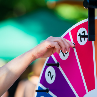
1. Red: A bold and attention-grabbing colour that can create a sense of urgency, excitement, and passion. Red is ideal for brands that want to create a sense of energy and excitement.
2. Blue: A soothing and calming colour that can create a sense of trust, intelligence, and reliability. Blue is great for brands that want to convey a sense of stability and security.
3. Yellow: A bright and sunny colour that can create a sense of optimism, cheerfulness, and creativity. Yellow is ideal for brands that want to create a fun and playful atmosphere.
4. Green: A natural and refreshing colour that can create a sense of growth, health, and harmony. Green is ideal for brands that want to convey a sense of eco-friendliness and sustainability.
5. Black: A sleek and sophisticated colour that can create a sense of elegance, power, and exclusivity. Black is ideal for luxury brands that want to convey a sense of high-end quality and status.
Take a look at our gallery pages to see more examples of how we use colour.
Using Colour to Motivate Behaviour
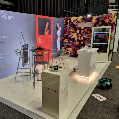
Colour psychology studies have shown that colour can affect behaviour and decision-making. For example, red can encourage appetite and impulse buying, while blue can encourage trust and loyalty. Understanding colour psychology can help you use the right colours to achieve your goals, whether attracting more visitors, increasing sales, or promoting a certain message. At Displays 2 Go we consider this when creating design concepts for our clients. In this image, you can see our use of white plinths on the stand, and then the use of red to draw attention.
The use of colours at differing heights can also help to deliver more impact and deliver direction to the audience, thereby impacting their behaviour - think yellow brick road!
The 5 Most Used Colours on Exhibition Stand Designs
While the most impactful colours may vary depending on your brand and goals, there are 5 colours that are commonly used in exhibition stand designs:
1. White: A neutral and clean colour that can create a sense of purity and simplicity. White is often used as a background colour to showcase products or graphics.
2. Blue: As mentioned earlier, blue is a popular colour for exhibition stands, as it can create a sense of trust and intelligence.
3. Green: Green is also a popular colour for exhibition stands, as it can create a sense of freshness and eco-friendliness.
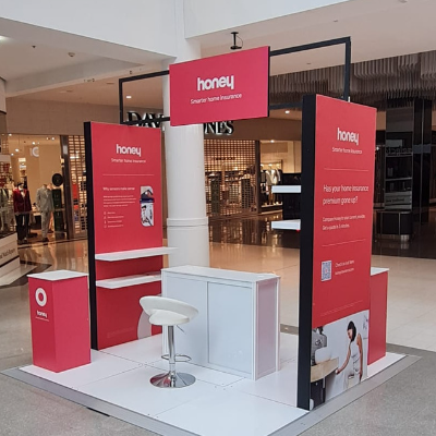
4. Red: Red is often used to create an eye-catching element in an exhibition stand, such as a logo or a call-to-action.
5. Black: Black is often used to create a sense of sophistication and elegance, but it can also be used to create a strong contrast with other colours.
Need some help
So, what next?
At Displays 2 Go, we’ve been creating exhibition stands, mall displays and sampling campaigns for over 15 years. We understand that colour is a powerful tool in design that can help you create a memorable and effective display.
By understanding colour psychology, choosing the right colours for your brand and goals, and using them effectively to motivate behaviour, we can create an exhibition stand that stands out from the crowd. Whether you choose red for its exciting energy, blue for its calming trust, or green for its refreshing eco-friendliness, the right colours can help you make a lasting impression on your audience.