

YOUR CART IS CURRENTLY EMPTY
Accessible signage: contrast, type size and readability
Published
Quick answer
Readable signage comes down to three things: strong contrast between text and background, letters sized for the distance people will read from, and a short message in a plain sans serif typeface. Aim for a contrast ratio of at least 4.5:1 between text and background (WCAG's floor for large text is 3:1), and size letters to the viewing distance: a minimum x-height of 12mm at 4m and 50mm at 15m. Put the key information between 900mm and 1,800mm above the ground, on a matt finish, in good light.
This page is practical design guidance for banners, displays and event signage. It is not a compliance check, and your venue or client may set its own requirements. Braille and tactile signs that a building must have, such as signs identifying exit doors and certain accessible facilities, are covered by the National Construction Code, so check those with your building certifier or access consultant.
Contrast: what ratio to aim for
Contrast is one of the biggest factors in whether someone with low vision can read your sign. The basic rule is simple: put a light colour on a dark background or a dark colour on a light one, and don't pair two colours of similar strength.
There are two ways to measure it, and you will see both in briefs:
| Measure | What it compares | Benchmark | Source |
|---|---|---|---|
| Contrast ratio (WCAG) | Relative luminance of text and background colours, from 1:1 to 21:1 | At least 4.5:1 for normal text; at least 3:1 for large text (18 point, or 14 point bold) | W3C WCAG Success Criterion 1.4.3; Vision Australia applies the same ratios to print |
| Luminance contrast (%) | Light reflected from the characters compared with the background | At least 30% for required braille and tactile signs, measured under the sign's actual lighting | National Construction Code, Specification 15 |
| Light reflectance value (LRV) difference | LRV of foreground and background colours | 70% treated as an acceptable standard for outdoor signage | City of Perth Wayfinding Guidelines 2024 |
The WCAG ratio is the easiest to check at design stage: any WCAG contrast checker will give you a ratio from two colour values. W3C chose 4.5:1 to account for the contrast loss that comes with moderately low visual acuity, colour vision deficiency and ageing, so treat it as a floor, not a target. Note that WCAG exempts logos and brand names, but the message around the logo still needs to pass.
WCAG defines large text in points for screens, and that doesn't translate neatly to a banner read from several metres away. For printed signs, the simplest approach is to aim for 4.5:1 for all text and use the distance table below to set the size.
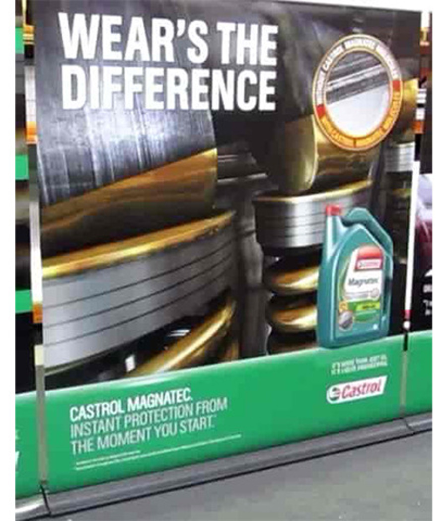
If your brand colours are soft, you can still use them. Strengthen the text with a contrasting outline, or set it on a solid panel or border that gives the contrast the brand colour can't. Avoid text over photographs or gradients, where contrast changes along the line.
Type size by viewing distance
The bigger the letters, the further away they read, so start with where people will stand. The City of Perth's wayfinding guidelines set out minimum letter x-heights for pedestrian signs (x-height is the height of a lower-case "x"):
| Required viewing distance | Minimum x-height of letters |
|---|---|
| 2m | 6mm |
| 4m | 12mm |
| 6m | 20mm |
| 8m | 25mm |
| 12m | 40mm |
| 15m | 50mm |
| 25m | 80mm |
| 35m | 100mm |
| 40m | 130mm |
| 50m | 150mm |
These are minimums for legibility, so go larger for audiences that include older people or people with low vision. For a pull-up banner in a foyer read from about 4m, a 12mm x-height is the floor for supporting text. Your headline should be several times that.
Size is also about how much you say. Keep a banner to three elements: a headline, a short line that supports it, and your logo. Put the words that matter in the upper part of the graphic, where tables and people standing in front won't hide them.
Typefaces, weight and spacing
Decorative scripts are hard to read from a distance, and accessibility guidance backs that up with specific advice.
- Use a plain sans serif. Vision Australia recommends sans serif fonts such as Arial and Helvetica. The City of Perth guidelines say the same for people with vision impairment.
- Avoid scripts and joined letters. Vision Australia notes that joined letters, common in script typefaces, make text less legible. If a script is part of your brand, keep it for a short tagline, not the message people need to read.
- Choose a tall x-height and open letter shapes. Typefaces with larger lower-case letters and open shapes in letters like "c", "a" and "e" are easier to read.
- Check characters that look alike. Capital "I", lower-case "l" and the number "1" should be easy to tell apart.
- Use regular or medium weight. The City of Perth guidelines note that very bold type can look as if it is spreading off the sign, and very light type falls back into the background.
- Write in sentence case or title case. Limit all capitals, italics and underlining.
- Give it space. Vision Australia recommends line spacing of at least 25-30% of the point size, with letters that are well spaced and never touching.
Colour choices and colour blindness
Vision Australia notes that red-green colour vision deficiency is far more common than total colour blindness. Two rules follow:
- Never use colour alone to carry meaning. If a map uses colour to separate zones or routes, add labels, icons or patterns as well.
- Check your palette in a colour-blindness simulation. The City of Perth tested its wayfinding palette for deuteranopia, a form of red-green colour vision deficiency, before adopting it.
Brand colours still matter. Colour is how people recognise you from across a hall, and our post on colour in stand design covers that side. The aim is to keep your brand colours while making sure the words pass a contrast check.
Placement height and lighting
A well-designed sign still fails if people can't see it.
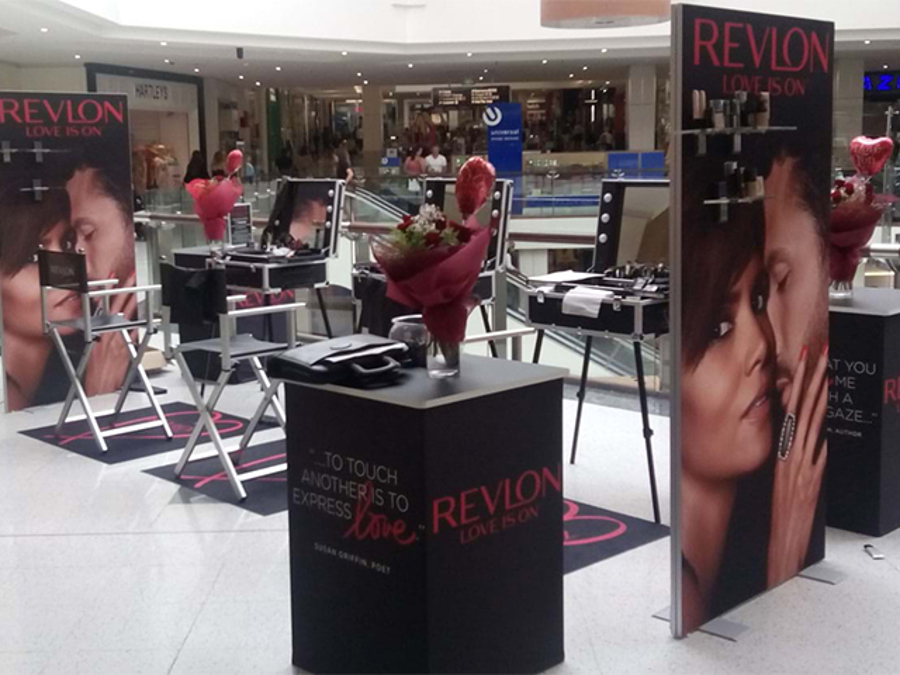
- Height. The City of Perth guidelines place important information between 900mm and 1,800mm above ground level, for physical accessibility and the best visibility.
- Finish. Use a matt finish to avoid reflections, especially where the sign faces windows or spotlights.
- Lighting. Contrast depends on the light around the sign. The National Construction Code requires luminance contrast on braille and tactile signs to be met under the lighting where the sign will be located, and it is a good test for any sign. Check dim corners of a venue and outdoor sites in strong sun.
- Clear space. Keep the area in front of the sign free so people can get close enough to read it.
Screens and digital banners
WCAG was written for digital content, so it applies most directly to screens. Use the same contrast ratios. Vision Australia's guidance is to avoid flashing content, and where it can't be avoided, not to flash more than three times in any one-second period. Add synchronised captions to any video with speech.
Artwork checklist before you send to print
- Contrast ratio checked for every text and background colour pair: at least 4.5:1, and never below 3:1 even for large headlines
- Viewing distance measured on site and x-height checked against the table
- Plain sans serif typeface in regular or medium weight, sentence case or title case
- Three elements only: headline, short supporting line, logo
- Key information in the upper part of the graphic, between 900mm and 1,800mm above the floor once installed
- No text over busy photographs or gradients
- Colour never the only way information is shown, and palette checked for red-green colour vision deficiency
- Matt finish specified for areas with strong or direct light
- File built to our artwork specifications: high-resolution PDF, CMYK, fonts outlined or embedded, 10mm bleed unless the template says otherwise
Next step
Colour on screen and colour in print are not the same. When contrast matters, ask for a printed A3 proof ($45 ex-GST each) and check it at the real viewing distance and in light like the venue's. For a second set of eyes on your files, our pre-flighting service costs $45 ex-GST per job and includes digital proofs for approval. Browse our banner stands or see how we support government and council displays, then call 1300 240 250 to talk through your project.